Regression as estimation under uncertainty, with lm and broom
statistics
regression
broom
uncertainty
modelling
The regression line is the most used –and most over-trusted– model on Earth. Learn to fit it, tidy it with broom, dress it in honest uncertainty with the bootstrap, and dodge its classic traps: Anscombe’s quartet, extrapolation, and regression to the mean.
Author
Nelson Amaya
Published
July 3, 2026
Modified
July 18, 2026
“All models are wrong, but some are useful.” –George E. P. Box
PART I: A line is an estimate, not a fact
Regression fits a line through a cloud of points. That sentence hides the statistical thinking: the line you get is computed from one sample, and the first session of this track taught you what that means –a different sample gives a different line. A regression coefficient without uncertainty is a single number pretending to be knowledge.
Back to our web-imported penguins. Does body mass predict flipper length?
Level: Intermediate · Time: ~45 min · Prerequisites: There is only one test · Tools: broom, dplyr, ggplot2
You will learn to
Fit a linear model with lm() and tidy its output with broom.
Attach honest uncertainty to a regression line with the bootstrap.
Recognise Anscombe’s quartet: identical regression output, very different data.
Avoid extrapolating a line beyond the range of the data that produced it.
Explain regression to the mean without mistaking it for a real intervention effect.
lm() –linear model– is base R’s regression engine, older than most people reading this, and still the workhorse under half the dashboards on Earth.
2
broom::tidy() turns the model into what this workshop loves: a tibble. One row per coefficient, with a confidence interval when you ask. No more squinting at summary() printouts –model results become data you can filter, join and plot.
Read the body_mass_kg row like a statistician: each extra kilo of penguin comes with about 15 more millimeters of flipper, plus or minus –the interval, not the point, is the finding. broom has two siblings worth knowing: glance(fit) (one row of model-level stats, like R²) and augment(fit) (your data with fitted values and residuals attached –the raw material of diagnostics).
PART II: Always plot. Always. –Anscombe’s warning
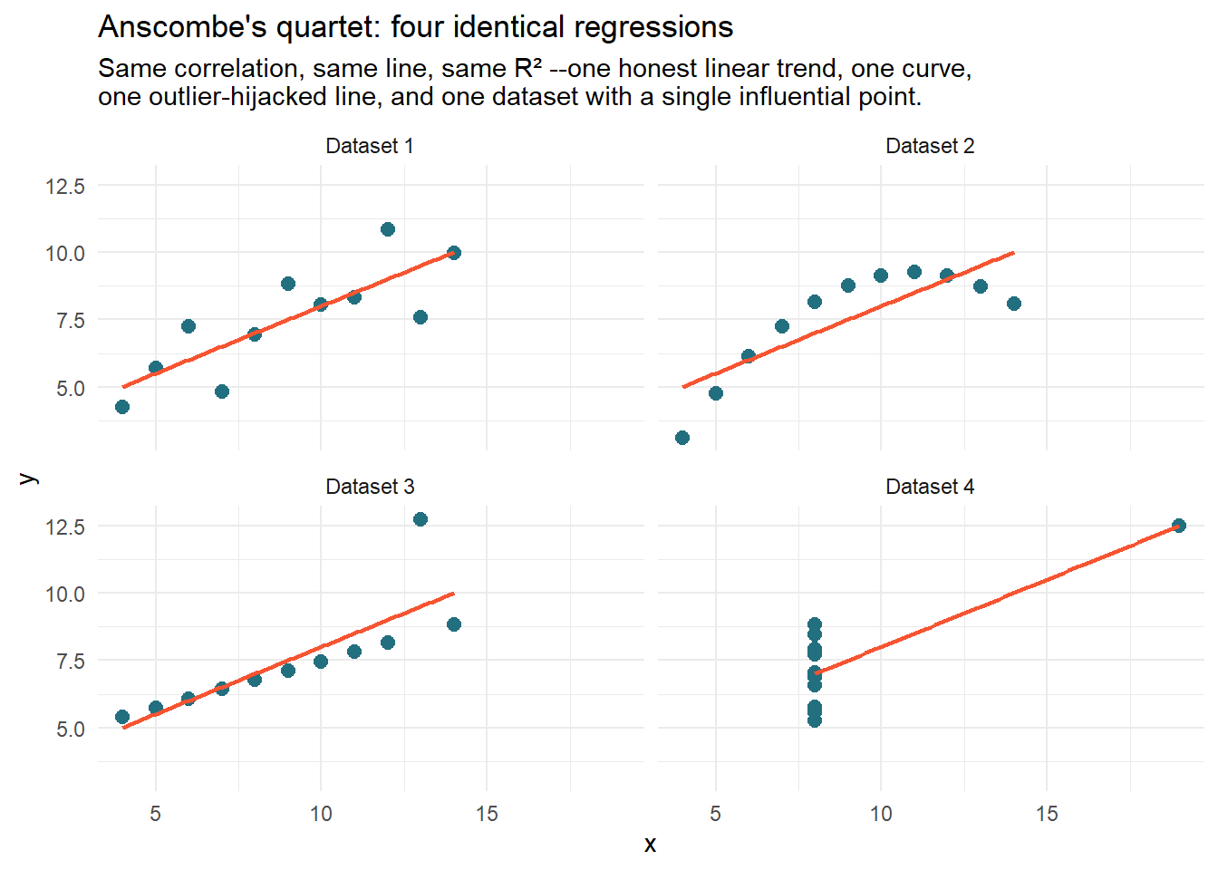
Before trusting any regression, meet the most famous four datasets in statistics, shipped with R since forever. Frank Anscombe built them in 1973 to have identical means, variances, correlations and regression lines:
anscombe_long |>ggplot(aes(x, y)) +geom_point(color ="#226F7F", size =2.5) +geom_smooth(method ="lm", se =FALSE, color ="#F75431", linewidth =0.8) +facet_wrap(~quartet, labeller =labeller(quartet = \(q) paste("Dataset", q))) +labs(title ="Anscombe's quartet: four identical regressions",subtitle ="Same correlation, same line, same R² --one honest linear trend, one curve,\none outlier-hijacked line, and one dataset with a single influential point." ) +theme_minimal()
The numbers cannot tell these datasets apart; your eyes do it instantly. Only dataset 1 is what the regression claims. Dataset 2 is a curve wearing a line costume; in 3 and 4, a single point is writing the summary1. The lesson survives fifty years unchanged: the model summary describes the model, not the data. Plot the data.
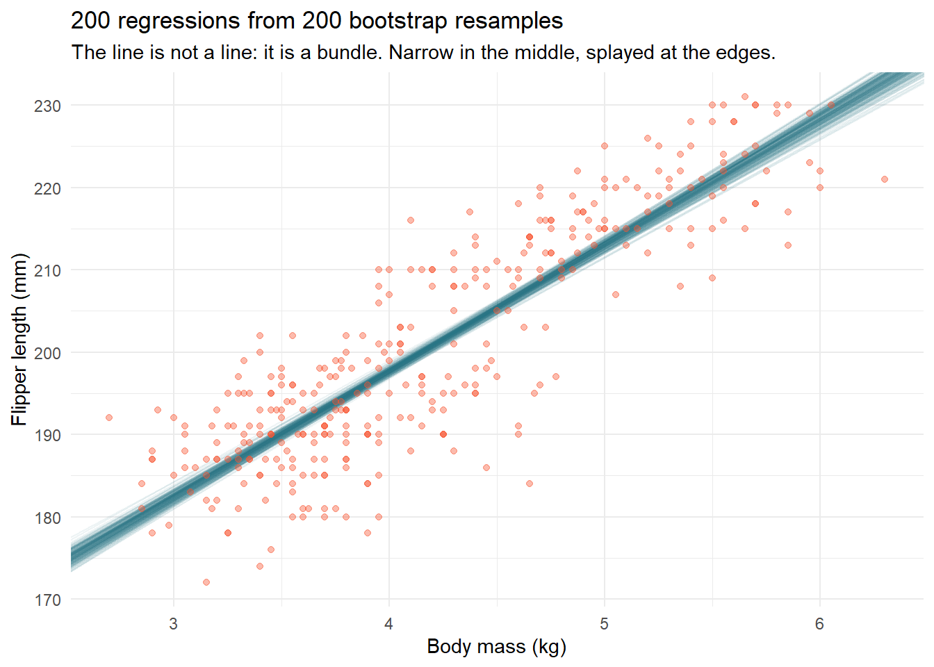
PART III: Uncertainty you can see –the bootstrap spaghetti
Confidence intervals on coefficients are honest but abstract. The previous session’s bootstrap makes uncertainty visible: resample the data 200 times, fit 200 lines, draw them all.
Show the code
set.seed(3)boot_lines <-tibble(replicate =1:200) |> dplyr::mutate(coefs = purrr::map(replicate, \(i) { penguins |> dplyr::slice_sample(prop =1, replace =TRUE) |>lm(flipper_length_mm ~ body_mass_kg, data = _) |> broom::tidy() |> dplyr::select(term, estimate) }) ) |> tidyr::unnest(coefs) |> tidyr::pivot_wider(names_from = term, values_from = estimate) |> dplyr::rename(intercept =`(Intercept)`, slope = body_mass_kg)penguins |>ggplot(aes(body_mass_kg, flipper_length_mm)) +geom_abline(data = boot_lines,aes(intercept = intercept, slope = slope),color ="#226F7F", alpha =0.08 ) +geom_point(color ="#F75431", alpha =0.4, size =1.5) +labs(x ="Body mass (kg)", y ="Flipper length (mm)",title ="200 regressions from 200 bootstrap resamples",subtitle ="The line is not a line: it is a bundle. Narrow in the middle, splayed at the edges." ) +theme_minimal()
1
One bootstrap resample: same number of rows, drawn with replacement –some penguins appear twice, some not at all.
2
Transparency does the statistics: where lines overlap the bundle is dark and certain; where they fan out, your model is guessing.
Notice where the bundle fans out: at the extremes of body mass, exactly where data is thin. Which brings us to the two classic ways this line will betray you.
Trap 1: Extrapolation
The bundle above is estimated on penguins between roughly 2.7 and 6.3 kg. Ask it about a 10 kg penguin and predict() will answer –cheerfully, precisely, and with no basis whatsoever:
A 291mm flipper on a penguin that doesn’t exist. The model doesn’t know where its data ended; you have to. Rule: a regression is a map of the territory it was fit on –outside it, you are not predicting, you are doodling2.
Trap 2: Regression to the mean
The name “regression” comes from a trap. Francis Galton noticed tall parents have tall-but-less-tall children and called it “regression towards mediocrity”. It is not biology –it is arithmetic that stalks any repeated measurement:
Show the code
set.seed(1877)students <-tibble(skill =rnorm(500, mean =70, sd =8),test_1 = skill +rnorm(500, sd =6),test_2 = skill +rnorm(500, sd =6) )students |> dplyr::mutate(group = dplyr::if_else(test_1 >=quantile(test_1, 0.9),"Top 10% on test 1", "Everyone else")) |> dplyr::summarise(mean_test_1 =round(mean(test_1), 1),mean_test_2 =round(mean(test_2), 1),.by = group )
1
Each student has one true, stable skill.
2
Each test = skill + luck. Nothing changes between tests –no teaching, no fatigue, nothing.
3
Yet the test-1 stars score worse on test 2, and (run it) the stragglers improve. Being in the top 10% partly means being skilled and partly means having been lucky –and luck doesn’t repeat.
# A tibble: 2 × 3
  group             mean_test_1 mean_test_2
  <chr>                   <dbl>       <dbl>
1 Top 10% on test 1        86.3        80.9
2 Everyone else            67.8        68.6
This arithmetic ghost produces endless false stories: the “sophomore slump”, the cursed magazine cover, the punished employee who improved and the praised one who slipped3, every “treatment” applied to the worst cases that then “works”. Whenever a group was selected for being extreme, expect it to drift back –before you credit any intervention.
PART IV: Prediction or explanation? Decide before you fit
One last piece of thinking the formula won’t do for you. The same lm() serves two different masters:
Prediction: you only care that outputs are close to reality. Feature meaning is irrelevant; held-out accuracy is the judge. This road leads to tidymodels and machine learning.
Explanation: you care why –what happens to flipper length if a penguin gains a kilo. This is a causal question, and no amount of R² answers it: a coefficient can be predictive and causally meaningless at once.
Confusing them is how “people who take vitamin X live longer” becomes a headline. Which is precisely the next session.
TipExercises 🏋️
Add species to the model: lm(flipper_length_mm ~ body_mass_kg + species, data = penguins). Tidy it. How does the mass coefficient change, and what does each species coefficient mean?
Run broom::augment(fit) and plot residuals (.resid) against fitted values (.fitted). Which Anscombe dataset does the pattern resemble?
Rebuild the spaghetti plot with only 30 randomly sampled penguins. How much wider is the bundle?
Regression to the mean, in the wild: in the students simulation, “treat” the bottom 10% of test 1 with a worthless intervention (add exactly 0) and compute their test-2 improvement. Write the press release, then debunk it.
Key takeaways
A regression coefficient is computed from one sample – a different sample gives a different line, so it needs uncertainty attached, not just reported bare.
Anscombe’s quartet: identical lm() output can hide wildly different underlying data. Always plot it.
A model built to predict and a model built to explain answer different questions – a coefficient can be predictive and causally meaningless at the same time.
Regression to the mean produces apparent “effects” from pure noise whenever you select on an extreme value.
The modern descendant is the datasauRus dozen: thirteen datasets with identical summary statistics, one of which is a T-Rex. Same moral, more teeth.↩︎
The canonical cautionary tale: a 2004 Nature paper extrapolated 100m sprint times to conclude women would outsprint men by 2156 –and, further out, that sprints would eventually finish in negative time.↩︎
Kahneman’s flight-instructor story: instructors “learned” that praise makes cadets fly worse and screaming makes them fly better. Both observations were regression to the mean; neither had anything to do with the feedback.↩︎
Citation
BibTeX citation:
@online{amaya2026,
  author = {Amaya, Nelson},
  title = {All Models Are Wrong 📏},
  date = {2026-07-03},
  url = {https://r4dev.netlify.app/sessions_thinking/03-regression/03-regression},
  langid = {en}
}