Mapping despair in the USA 🗺️
Learn how to visualise spatial data and create static and interactive maps
map
API
interactive
leaflet
sf
ggiraph
rayshader
Learn how to find, download and visualise spatial data. We’ll create static and interactive maps using ggplot2 and leaflet, using data on the opioid epidemic in the United States.
Drug abuse has become rampant in America and may be the worst the country has ever experienced.
–Angus Deaton & Anne Case
Level: Intermediate · Time: ~90 min · Prerequisites: Everything in its right place · Tools: sf, ggiraph, leaflet, rayshader
You will learn to
- Find, download and join spatial data with the numbers you want to map.
- Build a static choropleth map with ggplot2 and sf.
- Add interactivity with ggiraph and build a fully interactive map with leaflet.
- Understand what a coordinate reference system (CRS) is and why it matters.
- Render a 3D map with rayshader.
PART I: Walk before you run
Knowing how to build maps in R is mostly about navigating which packages and functions to use. Then it’s just about joining data between the spatial objects and the data objects you want to portray. Once you learn how to download spatial data, we’ll illustrate how to map it using the US opioid epidemic as an example.
Let’s start by reviewing the most useful packages and what each one does.
8 billion: A short detour to learn about simple features (sf)
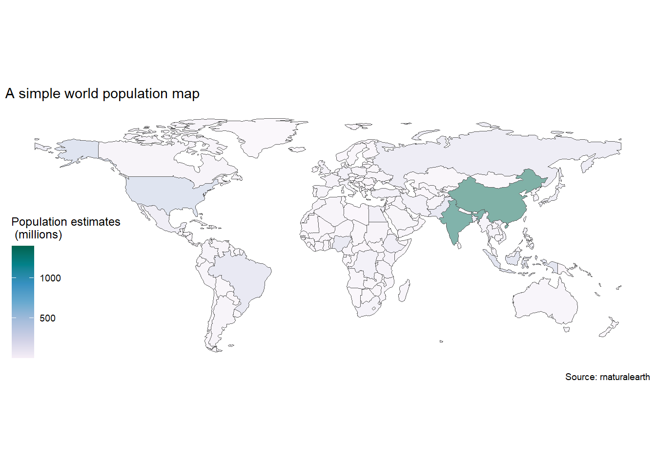
The world just hit 8 billion human population in 2022, so before we start looking at mapping in general, we’ll start with the easiest build a simple worldmap using the package sf, which is one of the most powerful geospatial packages available in R.
Geospatial data comes in many forms, and it’s useful to start by looking closely at one of them. There is a handy cheat sheet for this package that you can find here
We’ll download an sf map of the world using rnaturalearth package and then map world population. Take a close look at the coordinate system inside the last column in the world_sf map we downloaded. This column geometry is special, as it holds all the coordinates needed to plot define the border of each country, and is a key input of geom_sf().
library(sf) # Simple object package
library(rnaturalearth) # Contains a sf world map
library(ggthemes) # Gives us themes for maps
library(tidyverse) # Our old friends
1world_sf <- rnaturalearth::ne_download(returnclass = "sf")
2world_sf |>
3 dplyr::filter(ISO_A3!="ATA") |>
4 ggplot()+
5 geom_sf(
aes(fill=as.integer(POP_EST)/1e6,
geometry=geometry),
6 alpha=0.5)+
7 scale_fill_distiller(
palette = "PuBuGn",
direction=1,
name = "Population estimates\n (millions)")+
labs(title="A simple world population map",
caption="Source: rnaturalearth")+
ggthemes::theme_map()- 1
- Let’s download the worldmap as a sf file. Look at the file in the Viewer, what is different from other data frames? The geometry column
- 2
- Start with the map object
- 3
- Exclude Antarctica
- 4
- Feed data into ggplot
- 5
-
Use the
geom_sf()function with the aesthetics geometry and fill with the variable of interest - 6
-
Control transparency of the objects with
alpha - 7
- Add fill and name to the legend
Rejoinder: How we got to 8 billion – The movie
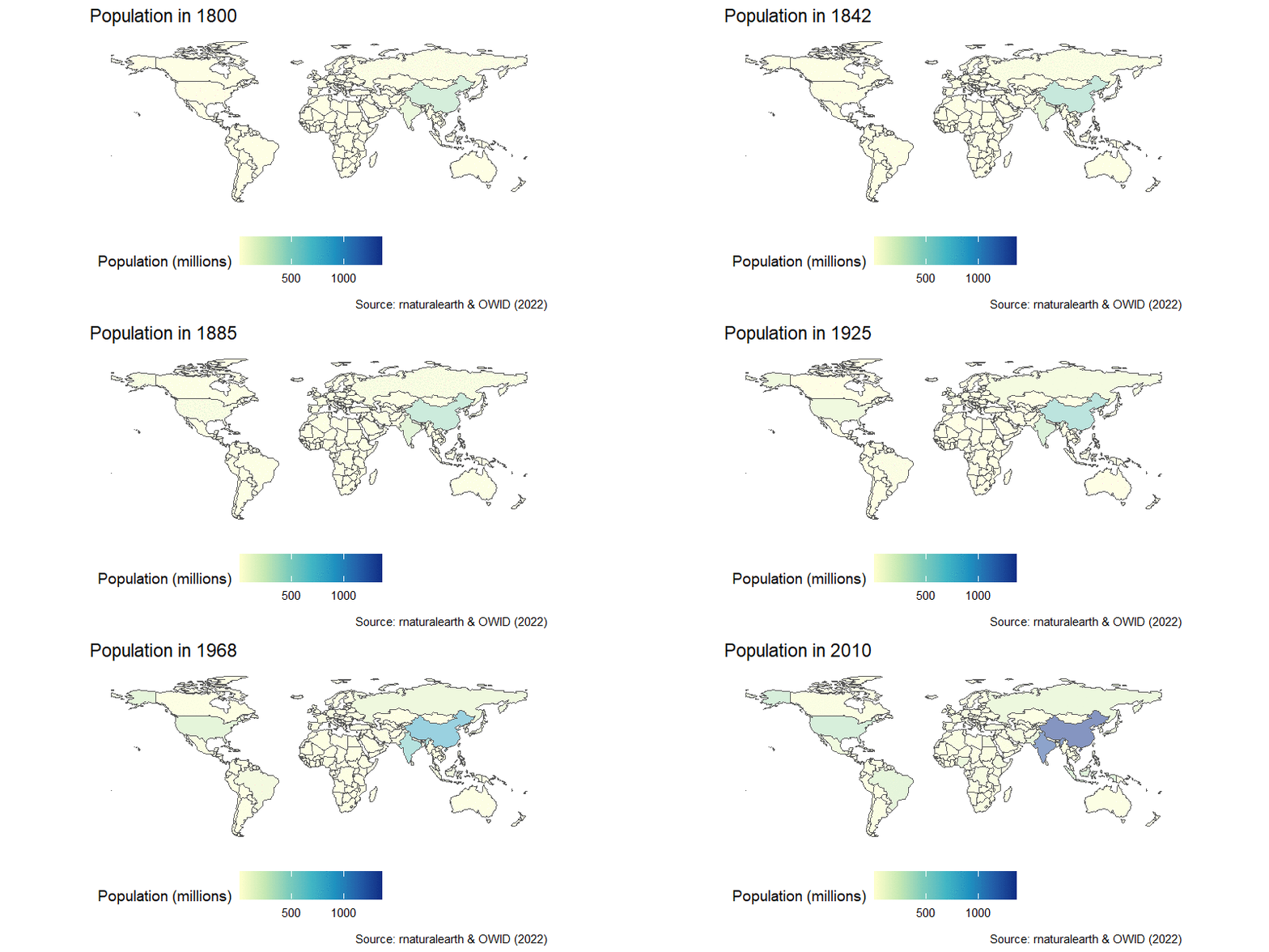
The population map can be easily turned into an animation, as you learned in the previous session. We can join the country-estimated population since 1800, which is available from OWID GitHub repository in a nice CSV format, and then we’re in familiar territory.
After a little wrangling where we use the countrycode package to join the map and population data, we add a time transition and a little formatting to get this result:
library(tidyverse)
library(gganimate)
library(transformr)
library(countrycode)
world_sf <- rnaturalearth::ne_download(returnclass = "sf")
owid_pop_url <- "https://raw.githubusercontent.com/owid/owid-datasets/master/datasets/Population%20by%20country%2C%201800%20to%202100%20(Gapminder%20%26%20UN)/Population%20by%20country%2C%201800%20to%202100%20(Gapminder%20%26%20UN).csv"
8world_pop_anim <- readr::read_csv(owid_pop_url) |>
9 dplyr::filter(str_ends(Year,"0"), Year<2020) |>
10 dplyr::rename(year = Year, country=Entity,pop=4) |>
11 dplyr::mutate(iso3c = countrycode::countrycode(country,"country.name","iso3c")) |>
12 dplyr::right_join(world_sf |>
dplyr::select(ISO_A3,geometry),
by=c("iso3c"="ISO_A3")) |>
13 dplyr::filter(iso3c!="ATA") |>
ggplot()+
geom_sf(
aes(fill=pop/1e6,
geometry=geometry),
alpha=0.5)+
scale_fill_distiller(
palette = "YlGnBu",
direction=1,
name = "Population (millions)",
na.value = "grey75")+
labs(title="Population in {frame_time}",
caption="Source: rnaturalearth & OWID (2022)")+
theme_map()+
theme(legend.position = "bottom")+
14 gganimate::transition_time(as.integer(year))+
15 gganimate::ease_aes('linear')- 8
-
Download the data using
read_csv() - 9
-
Keep data for the end of each decade by selecting dates that end with zero using the
str_ends()function - 10
- Rename variables
- 11
-
Add country codes using
countrycode() - 12
-
Join data to
sfmap - 13
- Exclude Antarctica
- 14
- Use transition time to an integer year
- 15
- Ease the animation using a linear scale of frames
Rejoinder: ggiraph world map of GDP per capita
Reusing the Maddison Project data, we can easily build an interactive sf map of GDP per capita across the world using ggiraph and viridis.
library(ggiraph)
library(sf)
library(tidyverse)
library(countrycode)
library(ggthemes)
library(patchwork)
library(rnaturalearth)
library(viridis)
library(viridisLite)
# First build the pipe for ggplot ####
gdpp_gg <- readr::read_csv("https://raw.githubusercontent.com/owid/owid-datasets/master/datasets/Maddison%20Project%20Database%202020%20(Bolt%20and%20van%20Zanden%20(2020))/Maddison%20Project%20Database%202020%20(Bolt%20and%20van%20Zanden%20(2020)).csv") |>
dplyr::select(country=1,year=2,gdppc=3) |>
dplyr::filter(year==2018) |>
dplyr::mutate(iso3c = countrycode::countrycode(sourcevar = country, origin = "country.name", destination = "iso3c")) |>
dplyr::filter(!is.na(iso3c)) |>
dplyr::left_join(rnaturalearth::ne_download(returnclass = "sf") |>
dplyr::select(ISO_A3_EH, geometry),
by=c("iso3c"="ISO_A3_EH")) |>
ggplot()+
geom_sf_interactive(aes(geometry=geometry,
fill=gdppc,
data_id = gdppc,
tooltip=paste0(country,
"<br>GDP per capita: USD ",
gdppc |> round(digits=0) |>
format(big.mark=" "))))+
scale_fill_viridis_c_interactive(
trans = "log10",
labels = scales::number_format(),
name = "GDP per capita 2018",
option = "mako")+
coord_sf(crs = st_crs(4269))+
theme_map()
maddison_girafe <- ggiraph::girafe(
ggobj = gdpp_gg +
plot_annotation(
title = 'Look, GDP per capita across the world in 2018',
caption = 'Source: Own calculations based on Maddison Project and OWID'
),
16 options = list(
opts_toolbar(position = "top", pngname = "r4dev-gdppc"),
opts_tooltip(opacity = 0.8, css = "background-color:#AC0909;color:white;padding:5px;border-radius:3px;"
),
opts_hover(css = girafe_css(
css = "fill:orange;stroke:gray;",
text = "stroke:none; font-size: larger",
line = "fill:none",
area = "stroke-width:1px"
))
))
maddison_girafe- 16
-
Additional options in
girafe, included as a list.
PART II: Despair in the US
Over the past two decades, over 450 000 american have died from opioid-related overdoses. The reasons are varied and summarised in Deaths of Despair by Angus Deaton & Anne Case. Empire of Pain: The Secret History of the Sackler Dynasty by Patrick Radden Keefe shows the corporate interests behind the abuse of opioids, and chapter one God’s medicine of Pandora’s Lab by Paul Offit explains how the crisis was produced by a perfect storm of regulatory loopholes, perverse corporate interests and misguided advocacy.
Let us look at this crisis through a geospatial lens.
Getting the data from CDC using an API
The Center for Disease Control (CDC) has data on opioid-related deaths, called VSRR Provisional Drug Overdose Death Counts, and can be found in the US Data.gov portal. The data we are looking for is here and by clicking on the API button on the upper-right corner, choosing our format, in this case CSV, and can copy the location of the data for easy import to R.
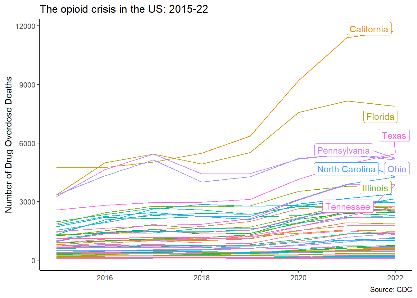
That way we can download it straight into R with read_csv() –Socrata portals serve plain CSV, no special package needed1. The only trick is the $limit parameter: without it, the portal politely hands you just the first 1 000 rows. Then we keep only the data we want and quickly plot it using ggplot2.
library(tidyverse) # Our old friend
# Get data from CDC portal
17cdc <- "https://data.cdc.gov/resource/xkb8-kh2a.csv?$limit=500000"
18opioid <- readr::read_csv(cdc) |>
19 dplyr::filter(str_detect(indicator,"Drug Overdose Deaths"))
# Plot aggregate data
opioid |>
dplyr::select(state,state_name,year,month,data_value) |>
20 dplyr::filter(state_name!="United States", year<2023, month=="December") |>
dplyr::group_by(state_name,year) |>
dplyr::summarize(opioid = sum(data_value)) |>
ggplot(aes(x=year,y=opioid,color=state_name))+
geom_line(show.legend = FALSE)+
ggrepel::geom_label_repel(
data = . %>% dplyr::filter(year==2022),
aes(label = state_name))+
labs(x=NULL,
y="Number of Drug Overdose Deaths",
title="The opioid crisis in the US: 2015-22",
caption = "Source: CDC")+
theme_classic()+
theme(legend.position = "none")- 17
-
We identify the CSV version of the data we want from the CDC page, and add
$limit=500000so the portal sends everything instead of its default 1 000-row page. - 18
-
Plain
read_csv()on the API URL –downloading from an API and reading a local file are the same gesture. - 19
-
The portal mixes several indicators in one table;
str_detect()insidefilter()keeps only the rows about drug overdose deaths. - 20
- Warning: the data includes an aggregate row for the whole US alongside the states. We need to exclude it.
Coordinates for a map
With the data by state, we can now map it.
The geodata package helps us easily bring coordinates data to R. We can download many types of coordinate systems, like elevation data or administrative borders at many levels. As we need US data at a state level, we can use the command gadm(), which stands for Global Administrative Areas.
Check out the result. This is a complicated object with an intimidating name: Formal class SpatVector.
But we don’t need to worry, as we don’t need to handle this object directly to build maps: we can transform it to our now favourite sf object using st_as_sf() function, which will give us a nice geometry column we already know how to handle.
- 21
-
We can retrieve coordinates for any country using
gadm()function. We include the country code for the US and the level we want. 1 for state, 2 for county. We also include the path where the map file will be downloaded. For convenience, we save it in the folder of the project. - 22
-
The raw object is hard to work with directly. We transform the SpatVector object to our favourite sf using
st_as_sf().
Joining data to coordinates
Now we need only join the data from the us_state data frame and the opioid data we had saved before. For this we use our old friend: the left_join() function and the pipe. However, before all this magic happens, we find that we have a conflict: 2 packages use the same functions filter() and select() and we have to choose which one takes precedence. This is easy and fast with the conflicted package, and we choose dplyr:
library(sf)
library(tidyverse)
library(conflicted)
conflicted::conflict_prefer("select","dplyr")
conflicted::conflict_prefer("filter","dplyr")
conflicted::conflicts_prefer(base::setdiff)
# Let's first simplify and summarize the opioid data. We'll call the new data frame opioid_states
opioid_states <- opioid |>
dplyr::select(state_name,year,month,data_value) |>
dplyr::filter(state_name!="United States",month=="December") |>
dplyr::group_by(state_name) |>
dplyr::summarize(opioid = sum(data_value)/1000) #Change unit to thousands
# Now we join/merge the data with the spatial shapes for mapping stored in us_states
opioid_map <- us_state |>
#This command joins/merges the data on the left (coming down the pipe) onto the data on the right (inside of the function) using the variables we provide in by=c("name of variable on the left"="name of variable on the right") option
dplyr::left_join(opioid_states,
by=c('NAME_1'="state_name"))Despair, state by state
Now we can map with ggplot2 using the geom_sf() option, which will draw the shapes for every state based on the coordinates we downloaded before and are stored in the us_state data frame. Then we wrap everything around girafe.
First, let’s use the gdtools package to make sure all girafe graphs use the font we like.
library(gdtools)
# Add our favourite font to girafe ####
gdtools::register_gfont("News Cycle")[1] TRUEgdtools::addGFontHtmlDependency(family = "News Cycle")Now with the map:
library(sf)
library(tidyverse)
library(conflicted)
library(ggthemes)
library(ggiraph)
library(patchwork)
# Declare conflicts
conflicted::conflict_prefer("filter", "dplyr")
# Now we can map the crisis
opioid_gg <- opioid_map |>
# Simplify by keeping only the variables we need
dplyr::select(state=NAME_1,opioid,geometry) |>
#We'll exclude Alaska and Hawaii to get a better looking map, and New York City
dplyr::filter(!state %in% c("Alaska","Hawaii","New York City")) |>
# Feed the data into ggplot
ggplot()+
# We have an sf object, so we just add the geometry and use the interactive option
ggiraph::geom_sf_interactive(
aes(geometry = geometry,
fill = opioid,
tooltip = paste0(state,
"<br>Opioid deaths: ", opioid)),
color=NA)+
#Include a fill option that makes a heatmap
ggiraph::scale_fill_distiller_interactive(palette="Spectral", name = "Deaths")+
# CRS projection
coord_sf(crs = st_crs(5070))+
# A theme for maps, which cleans the background
ggthemes::theme_map()
# Now girafe the map
opioid_girafe <- ggiraph::girafe(
ggobj = opioid_gg + plot_annotation(
title="Thousands of opioid overdose deaths in the US",
subtitle = "State aggregates 2015-22",
caption="Source: Own calculations based on CDC"),
fonts = list(sans="News Cycle")
)
opioid_girafe