Learn how to retrieve information from APIs and create interactive visualisations
API
httr2
interactive
ggplot2
plotly
ggiraph
Learn how to get information from APIs with httr2, and create interactive visualisations of historical GDP, Kyoto weather and archived Spotify songs using ggplot2, plotly and ggiraph.
Author
Nelson Amaya
Published
July 31, 2022
Modified
July 20, 2026
“Truth is much too complicated to allow anything but approximations.” –John von Neumann
Level: Beginner · Time: ~90 min · Prerequisites: Blogging with Quarto · Tools: httr2, ggplot2, plotly, ggiraph, tidyr
You will learn to
Turn a rough first plot into a polished one, one deliberate change at a time.
Retrieve live data from a web API with httr2.
Reshape and tidy data with tidyr so it’s ready to plot.
Build interactive visualisations with plotly and ggiraph.
Choose a colour palette and labelling that don’t fight the data.
A good visualisation is never built in a single sitting. It always starts basic, inadequate, ugly even. It takes time to transform it into something worth any attention.
This session focuses on building plots using the grammar of graphics –how you can build any graph from three elements: 1) data, 2) a coordinate system, and 3) visual marks that represent each data point. This will serve as an introduction to ggplot2, which is a powerful visualisation package from the tidyverse.
To get us started, we’ll tell a story of how to visualise cross-country comparisons of GDP per capita. The first chapter: importing the data into R.
To begin, we look for the data we need. The Maddison Project has data in Excel and Stata to download (see here), but there is a better way to get it. We copy the URL that leads directly to the raw data in OWID’s GitHub catalog, and with the read_csv() function we can import it straight into R –no downloading, no unzipping, no clicking.
TipWhere OWID data lives now
The GitHub catalog we read from below was archived in 2022 –it still works, and it will always return the same numbers (which is why this workshop keeps using it: reproducibility). For current data, Our World in Data now serves every chart on its site as a clean CSV: take any chart URL and append .csv to its grapher address, like https://ourworldindata.org/grapher/gdp-per-capita-maddison-project-database.csv. The documentation is here.
One thing you’ll notice about the data is that it only has country names. No regions, continents, of other geographical aggregates.
We’ll use the incredibly handy countrycodes package to add regions and country ISO3 codes, which is a convention that will save you a lot of time and headaches from country names spelled differently, or in other languages. We’ll also use the clean_names() function from the janitor package to handle the long and capitalized names of the variables in the data easily.
TipThe end of inconsistent contry names/codes: countrycodes
Country names and codes are a headache. They often come in different naming conventions, different spelling or special characters. countrycodes package solves the problem by looking in a huge library of spellings and coding conventions, so you can have retrieve the names or codes for countries and regions as needed.
Take 1: A first, very ugly, graph
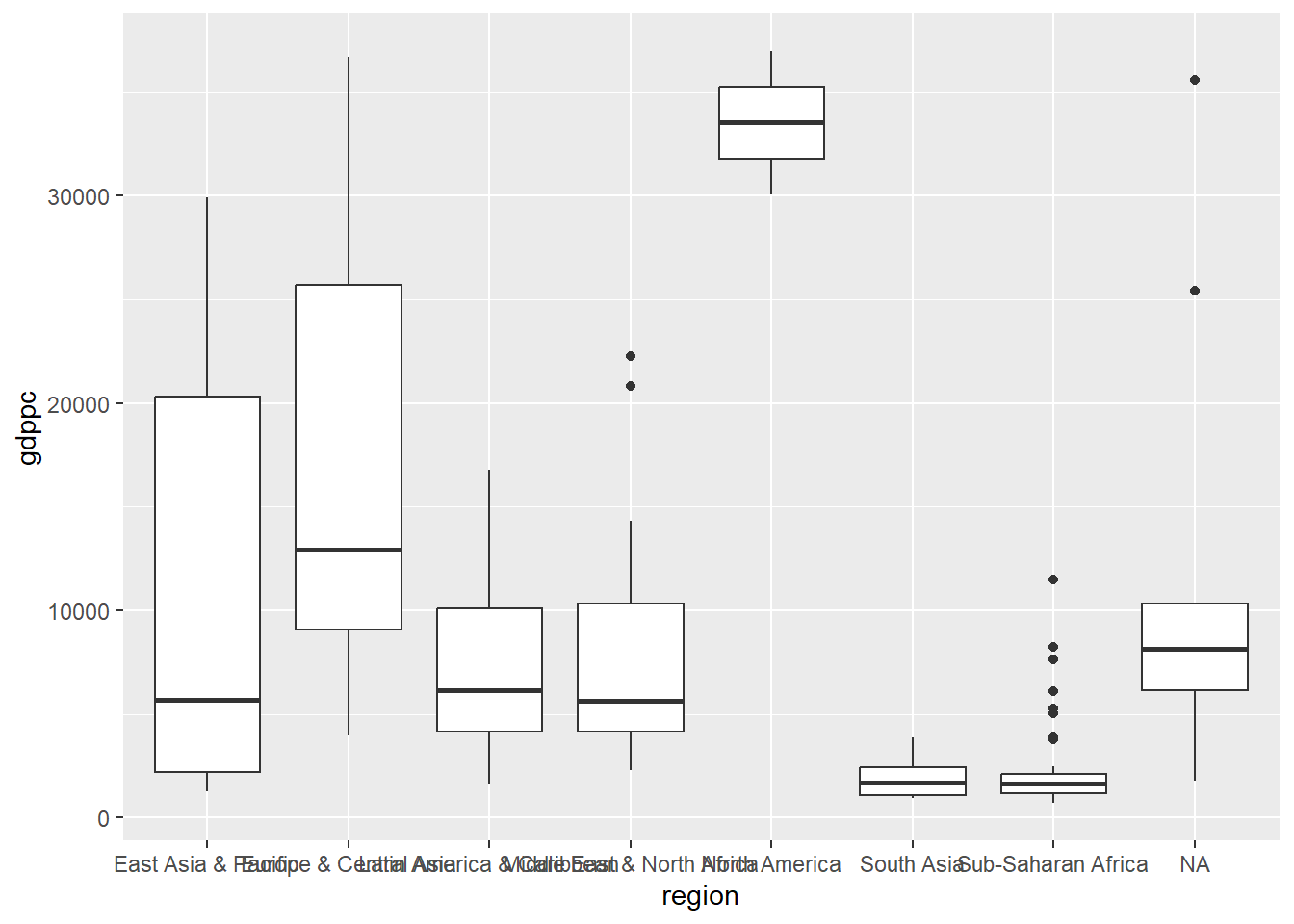
With the data downloaded into R, and the country regions and codes added to it, we can make our first plot. We filter the data for the year 1990 and feed it to ggplot. Given that reach region has multiple countries, we’d like to plot the distribution of GDP per capita within each region. There are many geometries in ggplot that accomplish this, so we’ll use the simplest one geom_boxplot().
Notice that within ggplot we don’t use the pipe anymore: to add options, we use the + operator.
Start with the raw data and save to a new data frame
3
We clean the variable names using the clean_names() function and shorten even further the GDP per capita variable name using rename()
4
Add country 3-digit ISO code and region using the countrycode() function
5
Filter for year 1990
6
Pipe data into ggplot and define X and Y axis
7
Show a boxplot
8
Let’s send the result to the console to see it
A first, ugly, plot
TipLearn to love the pipe
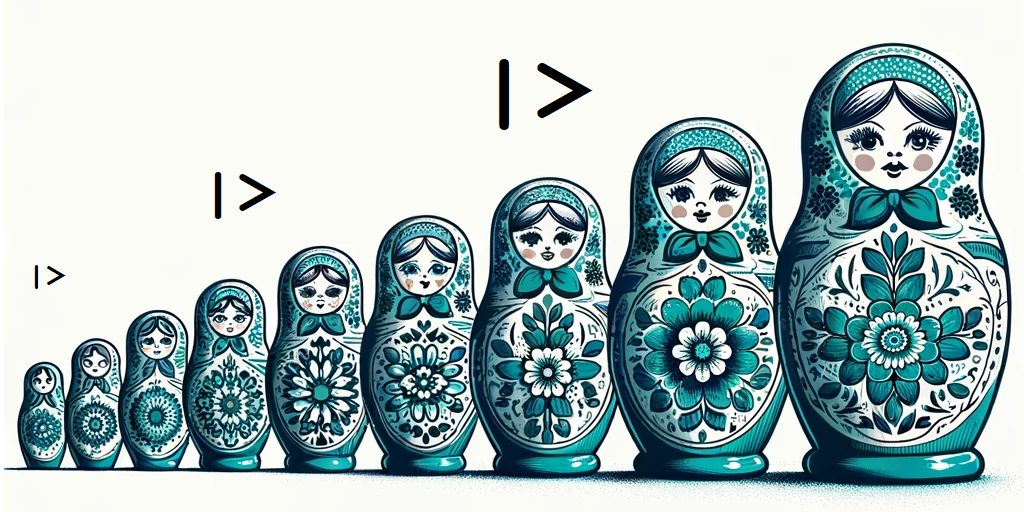
The pipe |> or %>% lets you sequentially chain many operations together and avoid “Russian doll” coding, where you put operations within operations and get quickly get lost on which parenthesis closes which operation.
The pipe is very simple: x |> f(y) is equivalent to f(x,y). Learn to love it.
Confused? Think of |> as a Matryoshka of sequential instructions
This plot already tells us a few things. First, some regions have more variability than others because they have more countries. North America is composed of three countries only, and the box plot doesn’t do a good job in showing the differences. Perhaps we want a continent variable instead of region.
We can also see that the labels overlap and are hard to read, the labels of the axis are not super clear, we have an NA region, and the graph lacks a title and a source. We have a lot of work ahead.
Take 2: Reorder, log, remove defaults
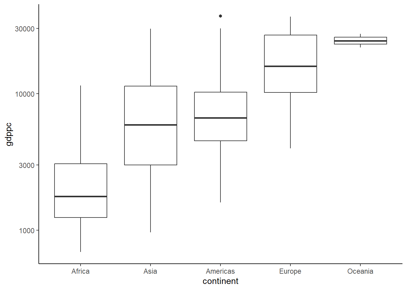
We’ll change the aggregate axis from region to continent using countrycode() again and remove subregion aggregates, filtering all empty values of the continent variable using the filter() function and the is.na() function preceded by *!* operator, which does the inverse of any function (as in !x = not x).
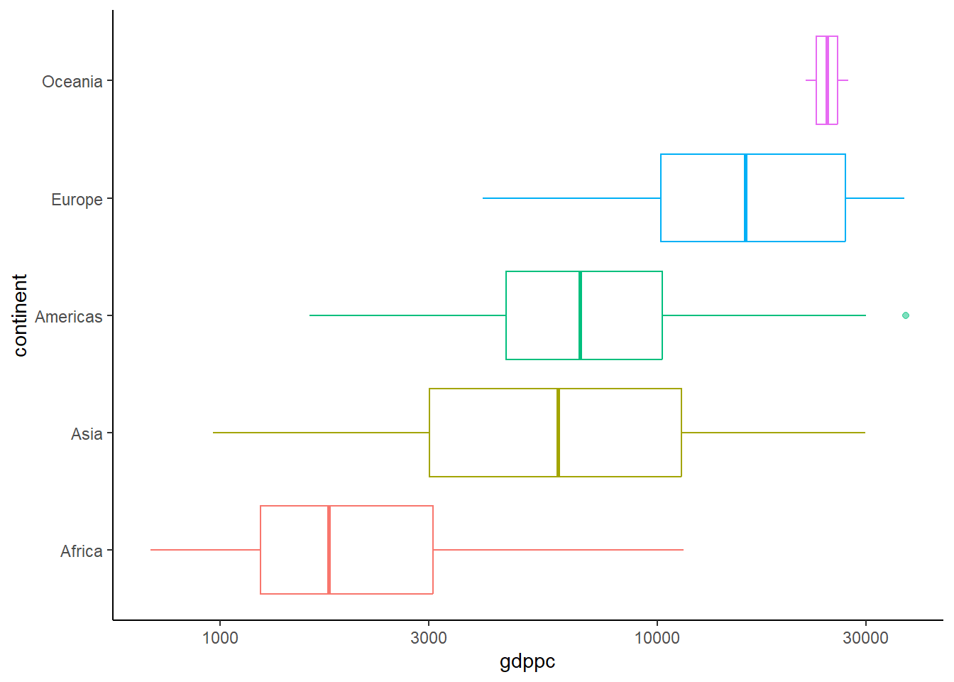
Then we create an ordering variable to sort the continents from higher to lower median GDP per capita levels using group_by() and mutate(). We can then reorder our continent variable using this newly-created median by factoring the variable and using this median to order it with fct_reorder(). As we are dealing with a wide range of GDP per capita levels, we can also change the scale of the axis to a logarithmic scale using scale_x_log10().
By default, the plot includes a grey background and other features we can do without. We use a theme that cleans the plot from background colors and other features that ggplot uses by default. The clean theme we use is theme_classic(), which makes the plot more focused in the information being conveyed.
We do all this in the same pipe we built before, and this is the result:
library(tidyverse)library(countrycode) # Data ####9owid_maddison_proj_df2 <- owid_maddison_proj_df |>10 dplyr::mutate(continent = countrycode::countrycode(sourcevar = iso3c, origin ="iso3c", destination ="continent"))# New attempt ####maddison_proj_2 <- owid_maddison_proj_df2 |>11 dplyr::filter(year==1990, !is.na(continent)) |>12 dplyr::group_by(continent) |>13 dplyr::mutate(m_gdppc =median(gdppc, na.rm=TRUE)) |>14 dplyr::ungroup() |>15 dplyr::mutate(continent =fct_reorder(continent, m_gdppc)) |>16ggplot(aes(x=continent,y=gdppc))+17geom_boxplot()+18scale_y_log10()+19theme_classic()+20theme(legend.position ="none")# See the result ####maddison_proj_2
9
We save a new data frame with the continent option
10
Add continent variable
11
Filter for the year we want and drop countries with no continent matched using !is.na()
12
Group the data by continent
13
Create a new variable with the median of GDP per capita in each continent
14
Return to all data by ungrouping
15
Reorder the variable using factors
16
Pipe into ggplot and define X and Y axis
17
Show a boxplot
18
Display the axis in log scale
19
Use a theme that cleans the background
20
We suppress the legend everywhere with this option
A second, clearer, plot
WarningKeep your raw data free from your own mistakes
Creating Data and Modifying Data are totally different processes. Follow the seemingly trivial rule of never modifying your raw data to avoid making really big mistakes in your data workflow that can seriously undermine any project. Always create new objects based on the raw data instead of overwriting it.
Take 3: Re-scale axis
We can improve the figure by transforming the X axis to logarithm using scale_x_log10():
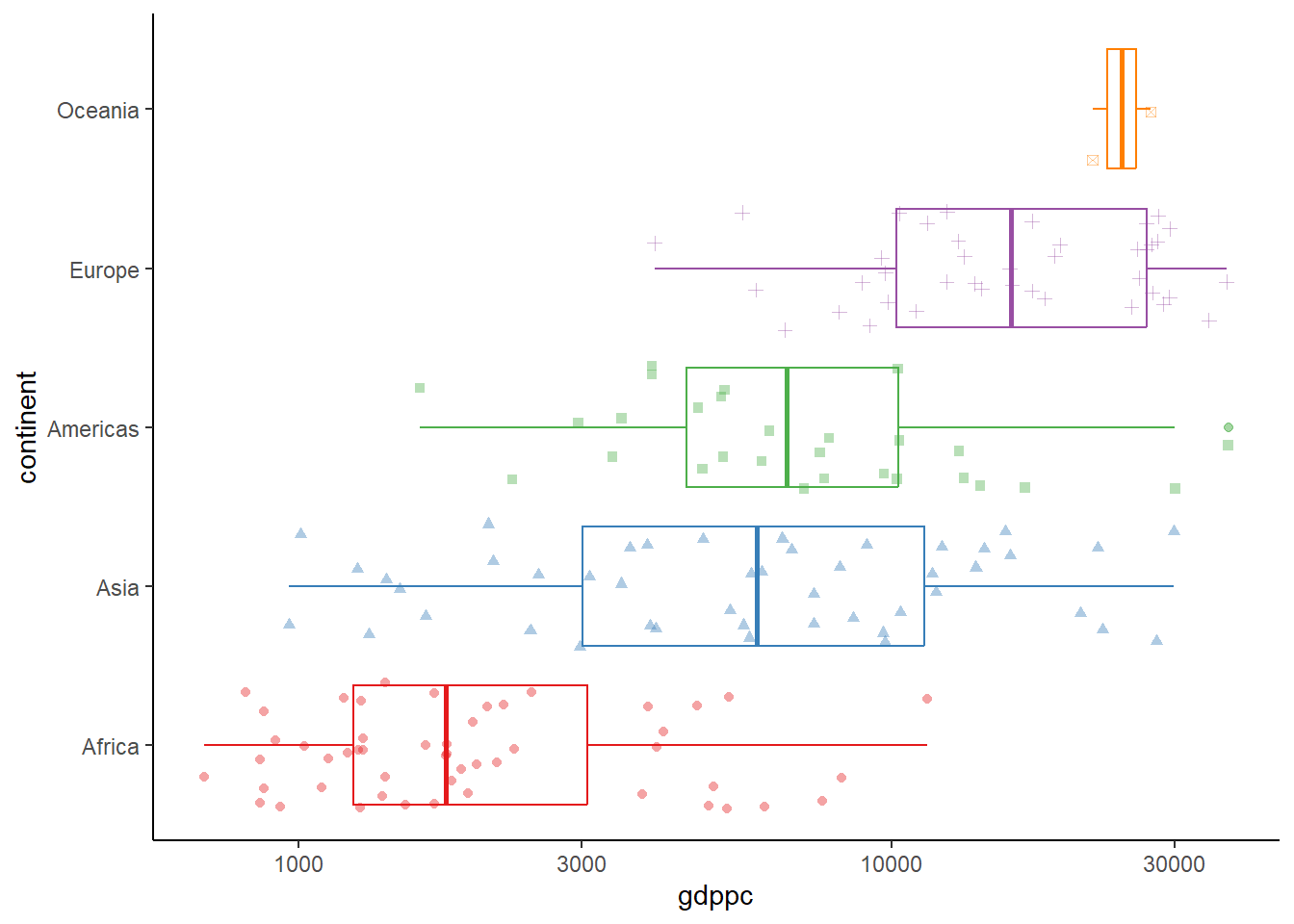
Now we add points for each data point around the boxplot using geom_jitter(), which adds random noise to each point so they don’t overlap. We’ll include a shape option to give a different shape to the points of each continent.We also use the RColorBrewer package to set a nicer color palette for each continent, and change the intensity of the color of outlier points using the outlier.alpha option within the geom.
Show jittered points colored by continent, with random noise so they don’t overlap
23
Set a color palette for continents
A forth attempt, adding more features
Take 5: Doing labels right
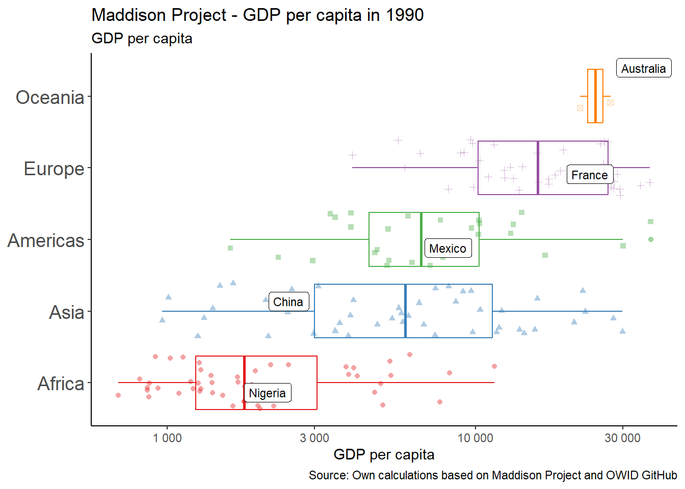
Finally we add labels, titles and subtitles. We also will create floating labels for one country in each continent: China, Mexico, Australia, France and Nigeria, which we filter within the geom. Notice how the data is filtered for only this text geom. We use the . operator, which is used to work from whatever data comes down the pipe, and then we filter the three countries we want to label.
We use ggrepel package for this.The geom_label_repel() will make sure the labels don’t overlap by, as the name suggests, repelling them from one another. We add the option position_jitter() so that the labels match the points with random noise that we had included when using geom_point() using the same positioning.
We also replace the scaling of the Y axis to something more flexible, using scale_y_continuous() and adding a few things to it: the breaks option, so the labels shown make more sense for this scaling, and number formatting using number_format().
TipHow do I handle long labels? Use scales
Sometimes you have very long or uneven text in an axis or legend, which makes the plot look terrible. Using the scales package, you can fix this by wrapping the label by a desired number of characters. Use the label = scales::label_wrap() option when labeling text to break across lines.
library(tidyverse)library(ggrepel)library(RColorBrewer)# A fifth visual ####maddison_proj_5 <- owid_maddison_proj_df2 |> dplyr::filter(year==1990, !is.na(continent)) |> dplyr::group_by(continent) |> dplyr::mutate(m_gdppc =median(gdppc, na.rm=TRUE)) |> dplyr::ungroup() |> dplyr::mutate(continent =fct_reorder(continent, m_gdppc)) |>ggplot(aes(y=continent,x=gdppc, color=continent))+geom_boxplot(outlier.alpha=0.5)+geom_point(aes(shape=continent), alpha=0.4, position =position_jitter(seed =1))+24 ggrepel::geom_label_repel(data = . %>%25 dplyr::filter(country %in%c("Mexico","China","Nigeria","France","Australia")),aes(label=country),26size=3, color="black",27position =position_jitter(seed =1) )+28scale_x_continuous(trans ="log10", labels = scales::number_format(big.mark=" "))+scale_color_brewer(palette="Set1")+29labs(y =NULL, x ="GDP per capita",title ="Maddison Project - GDP per capita in 1990",subtitle ="GDP per capita",caption ="Source: Own calculations based on Maddison Project and OWID GitHub")+theme_classic()+30theme(legend.position ="none",axis.text.y =element_text(size =14) )# Display plot ####maddison_proj_5
24
You can control the data that goes into each layer of ggplot2. The . operator stands for whatever data is in the ggplot() function at the top of the pipe, and you can pipe in more operations that apply only to this layer.
25
Filter Mexico, China, Nigeria and 1990 only for this geom.
26
Add an arrow().
27
Notice we add position to align the labels with the jittering.
28
Improve the log scale display using breaks and space between thousands digits using number_format()
29
Add multiple labels to the plot: title, subtitle, caption
30
Increase size of continent axis label and drop the legend
A fifth version
Take 6: Facets
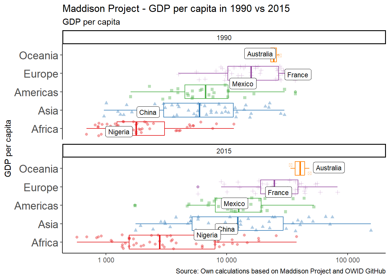
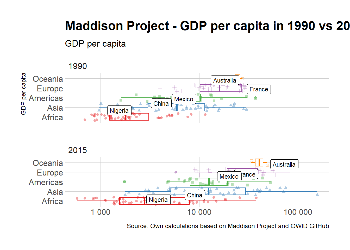
The final graph is going to take advantage of the fact that we have data for all countries for multiple years, and we can compare two moments in time instead of sticking with one cross section. So let’s compare 1990 to 2015 using faceting.
Faceting is a way to create multiple plots that share the same structure and axes but show different parts of data. You can use the facet_wrap() or facet_grid() to create faceted plots and break down your data into smaller, more manageable groups, and visualise them separately.
facet_wrap() is used when you want to create a single row or column of plots, where each plot represents a different part of your data. You specify the variable to facet on using the ~ symbol, and the number of columns or rows you want using the ncol or nrow arguments. We use nrow=2 so the two graphs, for 1990 and 2015, appear one on top of the other.
library(tidyverse)library(ggrepel)library(RColorBrewer)# New version with facets ####maddison_proj_6 <- owid_maddison_proj_df2 |> dplyr::filter(year %in%c(1990,2015), !is.na(continent)) |> dplyr::group_by(year, continent) |> dplyr::mutate(m_gdppc =median(gdppc, na.rm=TRUE)) |> dplyr::ungroup() |> dplyr::mutate(continent =fct_reorder(continent, m_gdppc)) |>ggplot(aes(y=continent,x=gdppc, color=continent))+geom_boxplot(outlier.alpha=0.5)+geom_point(aes(shape=continent), alpha=0.4, position =position_jitter(seed =1))+ ggrepel::geom_label_repel(data = . %>% dplyr::filter(country %in%c("Mexico","China","Nigeria","France","Australia")),aes(label=country), size=3, color="black", arrow =arrow(type ="closed"),position =position_jitter(seed =1))+scale_x_continuous(trans ="log10",labels = scales::number_format(big.mark=" "))+scale_color_brewer(palette="Set1")+31facet_wrap(~year, nrow=2)+labs(x =NULL, y ="GDP per capita",title ="Maddison Project - GDP per capita in 1990 vs 2015",subtitle ="GDP per capita",caption ="Source: Own calculations based on Maddison Project and OWID GitHub") +theme_classic()+theme(legend.position ="none",axis.text.y =element_text(size =14) )# Display plot ####maddison_proj_6
31
Faceting means splitting the graph into multiple parts based on one or multiple variables
A new version, with faceting
Final take: Themes
The final transformation involves themes. They are an essential part of the grammar, helping you control the non-data parts of their plots, such as titles, labels, fonts, background, grid lines, and more. The list is loooong. The idea is to make it easy to modify the appearance of plots without changing the underlying data or the type of plot.
We will use another package hrbrthemes to finish our plot. Notice that I just add a new layer to the earlier figure. We use the theme_ipsum_rc() function and this is the result:
library(tidyverse)library(ggrepel)library(RColorBrewer)library(hrbrthemes)# A final visual ####maddison_proj_7 <- maddison_proj_6 + hrbrthemes::theme_ipsum_rc()+theme(legend.position ="none",axis.text.y =element_text(size =12) )# Display plot ####maddison_proj_7
A final version, with a predfined theme
Before and after
The plot is not yet ready for publication; there are other improvements we could do.
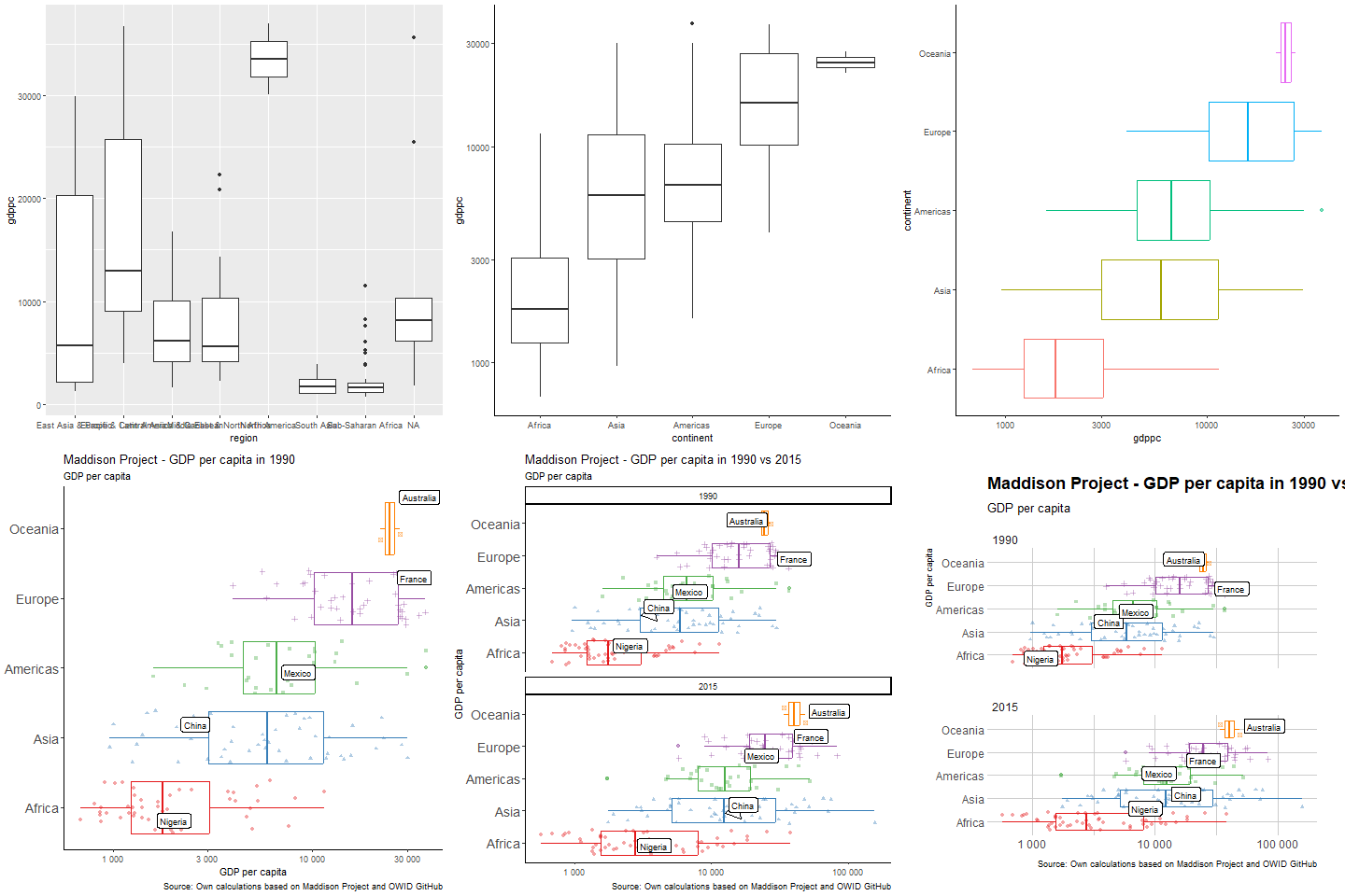
But let’s compare where we started and where we are now:
Figure 1: The story of a plot
PART II: Knock on the front door: APIs
APIs (Application Programming Interfaces) are front doors to access databases online, and they are a wonderful resource. Instead of downloading a file by hand, you send a request describing exactly what you want, and the server sends back the data –usually as JSON, a nested text format that R can easily turn into a tibble.
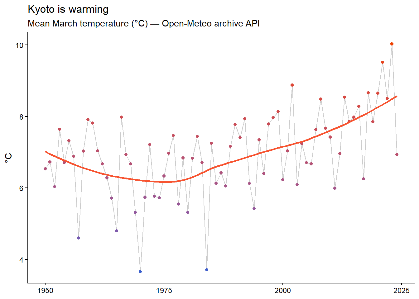
We will use the httr2 package, the tidyverse-adjacent tool for talking to APIs, and knock on the door of Open-Meteo, a free weather API that requires no account, no token, no key. We’ll request 75 years of daily temperatures for Kyoto. Why Kyoto? Remember the cherry blossoms: in session 4 you’ll animate 1,200 years of sakura bloom dates, and this data tells the other half of that story.
library(tidyverse)library(httr2)# Build the request ####32kyoto_req <- httr2::request("https://archive-api.open-meteo.com/v1/archive") |>33 httr2::req_url_query(latitude =35.01,longitude =135.77,start_date ="1950-01-01",end_date ="2024-12-31",daily ="temperature_2m_mean",timezone ="Asia/Tokyo" )# Knock on the door and parse the JSON answer ####kyoto_resp <- kyoto_req |>34 httr2::req_perform() |> httr2::resp_body_json(simplifyVector =TRUE)# Rectangle the nested answer into a tibble ####35kyoto_temp <-tibble(date = lubridate::as_date(kyoto_resp$daily$time),temp = kyoto_resp$daily$temperature_2m_mean )# Mean March temperature, year by year ####kyoto_temp |> dplyr::filter(lubridate::month(date) ==3) |> dplyr::group_by(year = lubridate::year(date)) |> dplyr::summarise(march_temp =mean(temp, na.rm =TRUE)) |>ggplot(aes(x = year, y = march_temp)) +geom_line(color ="grey80") +geom_point(aes(color = march_temp), show.legend =FALSE) +36geom_smooth(se =FALSE, color ="#F75431") +scale_color_gradient(low ="royalblue3", high ="orangered2") +labs(title ="Kyoto is warming",subtitle ="Mean March temperature (°C) — Open-Meteo archive API",x =NULL, y ="°C") +theme_classic()
32
request() starts from the API’s base URL –copy it from the API documentation.
33
req_url_query() adds our questions to the request: where (coordinates), when (dates), and what (daily mean temperature). Every API documents which parameters it understands.
34
req_perform() actually sends the request over the internet; resp_body_json() parses the JSON answer. simplifyVector = TRUE turns JSON lists into ordinary R vectors.
35
The answer is nested: the daily values live inside $daily. We rectangle them into a tidy tibble with one row per day.
36
geom_smooth() adds a trend line –Kyoto’s March has warmed by roughly 2°C since 1950, which is why the sakura bloom keeps breaking “earliest ever” records.
Spring is arriving earlier in Kyoto
Feel the music: the Spotify story
This section used to teach APIs with Spotify: using the spotifyr package, you could download audio features –danceability, energy, valence– for every song of every artist. It was glorious.
Then, on 27 November 2024, Spotify shut those endpoints down for new applications. No deprecation period, no replacement. Thousands of analyses, blog posts, theses and workshop sessions –including this one– broke overnight.
ImportantAPIs giveth, and APIs taketh away
An API is a door someone else owns; it can close without notice. This is the other lesson of this session: when your analysis depends on external data, save a raw copy the day you download it. Your future self will thank you. This workshop practices what it preaches –everything below runs on the snapshot we saved while the door was still open.
Luckily, we kept a snapshot: 1,178 songs by 8 artists, downloaded from the API before it closed. We can load it with read_csv() –and everything we care about teaching here (pivoting, ridgelines, interactivity) works exactly the same.
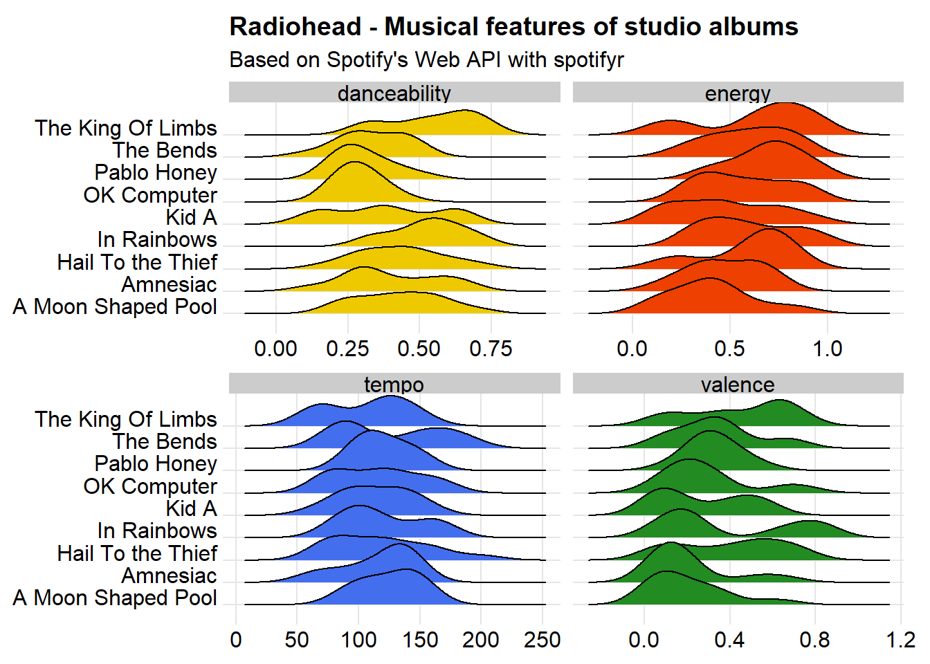
Now let’s compare some musical features of Radiohead’s studio albums. We will plot valence, tempo, energy and danceability.
Danceability: describes how suitable a track is for dancing based on a combination of musical elements including tempo, rhythm stability, beat strength, and overall regularity. A value of 0 is least danceable and 1 is most danceable.
Thom Yorke, Lotus Flower
Energy: a measure from 0 to 1 and represents a perceptual measure of intensity and activity. Typically, energetic tracks feel fast, loud, and noisy. For example, death metal has high energy, while a Bach prelude scores low on the scale. Perceptual features contributing to this attribute include dynamic range, perceived loudness, timbre, onset rate, and general entropy.
Tempo: estimated tempo of a track in beats per minute (BPM). In musical terminology, tempo is the speed or pace of a given piece and derives directly from the average beat duration.
Valence: a measure from 0 to 1 describing the musical positiveness conveyed by a track. Tracks with high valence sound more positive (e.g. happy, cheerful, euphoric), while tracks with low valence sound more negative (e.g. sad, depressed, angry).
Looking at the density of each variable for every album, we can see that A Moon Shaped Pool, their latest album and most mellow-sounding one, has the least energy, while The King of Limbs, which include the awesome track Lotus Flower, is the most energetic one.
The code below is kept as a museum piece –it ran while the API was alive, and the figure it produced is preserved beneath it. Read the code anyway: the pivot_longer() + geom_density_ridges() + facet_wrap() pattern is one you will reuse constantly, and Practice 2 asks you to reproduce it on the archive snapshot.
library(ggridges) # Overlaying density plots, perfect for probabilistic inferencelibrary(RColorBrewer)37radiohead_spotify |>38 dplyr::filter(album_name %in%c("Pablo Honey","The Bends","OK Computer","Kid A","Amnesiac","Hail To the Thief","In Rainbows","The King Of Limbs","A Moon Shaped Pool")) |>39 tidyr::pivot_longer(cols =c("valence","tempo","danceability","energy"), names_to ="metric") |>40ggplot(aes(x = value, y = album_name, fill=factor(metric))) +41geom_density_ridges(show.legend =FALSE) +theme_ridges() +42labs(title ="Radiohead - Musical features of studio albums",subtitle ="Based on Spotify's Web API with spotifyr",y=NULL,x=NULL)+43facet_wrap(~metric, scales ="free_x", nrow =2)+44scale_fill_manual(values =c("gold2","orangered2","royalblue2","forestgreen"))
37
We start with the archived Spotify data.
38
We keep only the studio albums with the x %in% y operator, which asks, for each element of x, “is it one of the values in y?”.
39
Do you remember endlessly Googling reshape in Stata? No more. pivot_longer() stacks the four chosen columns into two: a metric column with the variable name and a value column with its number –one row per song per metric.
40
We pipe the data into ggplot and define the aesthetics: what goes where.
41
With the ggridges package we use a better geometry for the data, overlapping density plots –one ridge per album. show.legend=FALSE drops the legend, redundant here because the facets are already labelled.
42
We add some labels to the plot.
43
Remember faceting? The long format pays off: facet_wrap(~metric) splits the plot into 4 panels in 2 rows, one per musical feature, each with its own x-scale.
44
We apply a manual color scale, so that each metric gets its own color.
Rendered in November 2024, days before the API closed. Dance Thom, dance!
TipPivoting with tidyr, or the joy of never having to Google reshape again
Pivoting with tidyr involves transforming data from a long format to a wide format, and vice versa.
The pivot_longer() function helps you convert data from a wide format to a long format by stacking multiple columns into a single column while preserving the relationship between variables. You specify cols = c(A, B) to indicate which columns should be transformed into a single variable column, and names_to = "variable" and values_to = "value" to specify the names of the resulting columns.
The pivot_wider() function allows you to spread values across new columns based on a specified variable. You specify names_from = variable to indicate that the variable column should be used as the column names in the resulting wide data frame, and values_from = value to indicate that the value column contains the data to be spread across the columns.
What it feels like to never Google reshape again
Comparing musical tastes
Let’s have some fun with the Spotify snapshot.
The archive holds the full discographies of 8 artists –the favourites of the workshop’s first cohort. Below we attach each favorite artist to the person who chose them, using tribble() to build the lookup table by hand and left_join() to merge it in.
library(tidyverse)45favorites <-tribble(~name,~artist,"zelie","Arctic Monkeys","romane","Ben Howard","nelson","Foals","rossana","Imagine Dragons","emma","Oasis","shivona","Milky Chance","valeria","Florence + The Machine","maelle","Michael Kiwanuka" )# Merge the lookup table into the snapshot ####46favorites_music <- spotify_archive |> dplyr::left_join(favorites, by ="artist")# One row per song ####47favorites_music
45
We create a list of favorites artists using tribble, a function we can use to manually create rectangular databases on the fly. First row uses the ~ operator to name variables and the rest are the values of each observation.
46
left_join() keeps every song in the snapshot and adds the name column wherever the artist matches –joins are the glue of the tidyverse, and you will use them constantly.
47
When the API was alive, this step was a for loop of API calls, one per artist (you already met loops in Part I). The snapshot spares us the wait –and the rate limits.
# A tibble: 1,178 × 7
   valence energy artist         track_name         album_name cover_url   name
     <dbl>  <dbl> <chr>          <chr>              <chr>      <chr>       <chr>
 1   0.506  0.558 Arctic Monkeys Arabella           AM         https://i.… zelie
 2   0.405  0.532 Arctic Monkeys Do I Wanna Know?   AM         https://i.… zelie
 3   0.74   0.953 Arctic Monkeys Fireside           AM         https://i.… zelie
 4   0.479  0.417 Arctic Monkeys I Wanna Be Yours   AM         https://i.… zelie
 5   0.288  0.81  Arctic Monkeys I Want It All      AM         https://i.… zelie
 6   0.587  0.542 Arctic Monkeys Knee Socks         AM         https://i.… zelie
 7   0.485  0.462 Arctic Monkeys Mad Sounds         AM         https://i.… zelie
 8   0.599  0.698 Arctic Monkeys No. 1 Party Anthem AM         https://i.… zelie
 9   0.842  0.668 Arctic Monkeys One For The Road   AM         https://i.… zelie
10   0.619  0.758 Arctic Monkeys R U Mine?          AM         https://i.… zelie
# ℹ 1,168 more rows
TipTibble? Tribble? What is the difference?
tibble: Using the tibble() function, you can create a new data frame from vectors. Each argument to tibble() becomes a column in the tibble, and you can use it to quickly assemble data frames without having to transpose or reshape the data.
tribble: Using the tribble() function, which stands for transposed tibble, you can easily do manual entry of data. The syntax of tribble() is useful for creating small data frames in a readable way, and involves specifying the column headers followed by the values row by row. For example, tribble(~x, ~y, 1, "a", 2, "b") creates a tibble with 2 columns (x, y) and 2 observations (x = c(1,2), y = c(“a”,“b”)).
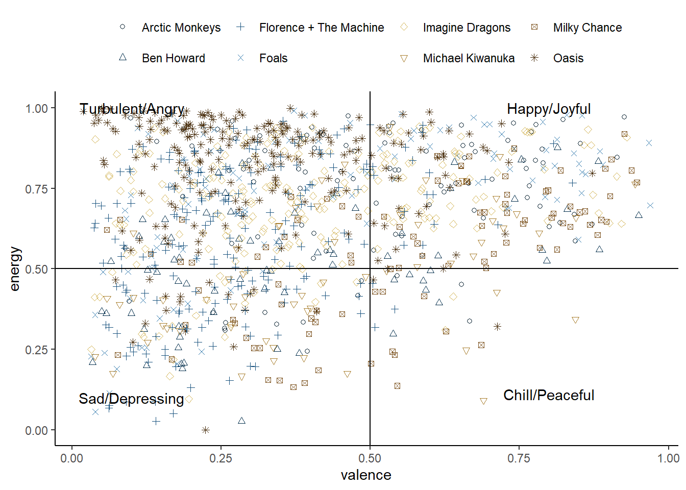
library(tidyverse)library(MetBrewer) # MET color palettes48favorites_music |>49ggplot(aes(y=energy,x=valence,color=artist))+50geom_point(aes(shape=artist))+51geom_hline(yintercept =0.5)+geom_vline(xintercept =0.5)+52annotate("text", x =0.1, y =1, label ="Turbulent/Angry")+annotate("text", x =0.8, y =1, label ="Happy/Joyful")+annotate("text", x =0.1, y =0.1, label ="Sad/Depressing")+annotate("text", x =0.8, y =0.11, label ="Chill/Peaceful")+53 MetBrewer::scale_color_met_d(name ="Ingres")+54scale_shape_manual(values =c(1:8))+55theme_classic()+56theme(legend.position ="top",57legend.title =element_blank())
48
We start from the joined snapshot –one row per song, with artist and fan attached.
49
Pipe in the data into ggplot
50
Create a first geometry and vary the point by artist using shape
51
Add some lines to create 4 quadrants
52
Include the name of each quadrant using annotate
53
Use a color palette from the MetBrewer package. We pick Ingres.
54
Specify the shapes of points manually
55
Use a theme that cleans the plot from noisy background
56
Position the legend at the top of the figure
57
Eliminate the title of the legend.
We’re missing out, let’s make this interactive with Plotly
With a single step we can make this plot interactive using the plotly library. Plotly is an incredibly powerful visualisation tool, but it has a different syntax from ggplot, so be careful not to confuse one with the other.
We can turn a ggplot2 figure into an interactive plot easily using the ggplotly() function. Look at the trick in the geom_point() function to make the tooltip work well.
Plotly wraps well around ggplot, and gives additional funcionalities with very little additional coding.
Create tooltip information for ggplotly. is new line in HTML.
60
Use ggplotly on a ggplot figure to transform it to an interactive plot.
TipWant to create a plot interactively? Use esquisse
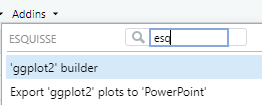
esquisse is a package that allows you to create and edit a plot using point-click. It will appear as an Add-in like shown below or you can launch it in the console using esquisser().
We can create multiple graphs that interact with each other using the ggiraph package.
We’ll add time to the first plot we made in this session. First, we will create two visualisations that will be connected to one another: a line that tracks GDP per capita through time, and a distributional plot like the latest version of the plot above.
We create each one separately using the extended geoms that the ggiraph package includes, which has the option _interactive at the end of geoms we already know. So we’ll use geom_point_interactive() for the line plot and geom_boxplot_interactive() for the distributional plot, and connect them to each other with the data_id and tooltip options.
We can then add both plots (literally, add them using the patchwork package) inside of girafe() in the ggobj option. Using the function plot_annotation() we can add title, subtitle and caption in a way that applies to both plots.
The result is two graphs that interact through the data_id and tooltip aesthetics.
What did we accomplish here? Simple: not overloading information into a single graph.
library(tidyverse)library(RColorBrewer)library(ggiraph) # To create interactive plotslibrary(patchwork) # To add plots together# GDP per capita through time by continent ####maddison_time <- owid_maddison_proj_df2 |> dplyr::filter(year>=1950,!is.na(continent)) |>61 dplyr::group_by(year, continent) |>62 dplyr::summarise(m_gdppc =median(gdppc, na.rm=TRUE), .groups ="drop") |> dplyr::arrange(continent, year) |>ggplot(aes(x=year,y=m_gdppc, color=continent))+63geom_path_interactive(aes(data_id=continent, tooltip=continent))+scale_x_log10()+scale_color_brewer(palette="Set1")+labs(x =NULL, y ="GDP per capita") +theme_classic()+theme(legend.position ="none")# Distribution of GDP per capita by continent ####maddison_continent <- owid_maddison_proj_df2 |> dplyr::filter(year>=1950,!is.na(continent)) |>ggplot(aes(y=continent,x=gdppc, color=continent, fill=continent))+64geom_jitter(color="grey90")+geom_violin(alpha=0.4)+65geom_boxplot_interactive(aes(data_id=continent, tooltip=continent))+scale_x_continuous(trans ="log10",labels = scales::number_format(big.mark=" "))+scale_fill_brewer(palette="Set1")+labs(x =NULL, y ="GDP per capita") +theme_classic()+theme(legend.position ="none")# Combines the two plots into one ####66ggiraph::girafe(67ggobj = maddison_time + maddison_continent +68plot_annotation(title ='Maddison Project - GDP per capita since 1950',subtitle ='GDP per capita by continent',caption ='Source: Own calculations based on Maddison Project and OWID'),options =list(69opts_hover_inv(css ="opacity:0.1;")),70width_svg =10,height_svg =6)
61
To create a summary statistic by year and continent, we first group the data
62
We use summarise() that will return only the computed tabulated result. Gotcha: summarise() on two grouping variables returns rows ordered by the first one (year), so consecutive rows alternate between continents. geom_path() connects points strictly in row order –with continents interleaved, every “line” would be a single disconnected point. arrange(continent, year) puts each continent’s years back-to-back so the path actually draws a continuous line per continent.
63
We use the ggiraph geom –notice the _interactive and the extra content in the aesthetics: data_id and tooltip.
64
We add points and a violin geometries
65
We add the interactive boxplot using the data_id and tooltip
66
We open the girafe() function to add the interactive graphs
67
Using the patchwork package we can layout multiple plots together
68
We can define annotations that will apply to all plots
69
We make the selection salient by making the rest less visible using opts_hover_inv()
70
We define the size of the plot
Using 🦒 in Spotify data to create a fancy tooltip
Using girafe we can also improve the Spotify music profile and add the cover image of each album to each point using htmltools and CSS to place the elements where we want.
The snapshot already carries the URL of each album cover in the cover_url column (when the API was alive, it hid inside a list-column and had to be pluck()-ed out –the archive saved you that step). We create a tooltip using the URL for each album cover by pasting HTML tags.
We create a tooltip with HTML tags for the album cover, using CSS flexbox to place elements together.
🏗 Practice 2: Music
Time to make your own plots – the Basic and Intermediate exercises run right here in your browser, on the same Spotify snapshot the session used.
NoteBasic
Compare song valence across the 8 artists with boxplots. Fill in the two blanks in aes(), then describe what you see: who records the happiest songs?
NoteHint
Map the numeric feature you want to compare to one axis and artist to the other – with 8 artist names, putting them on the y axis keeps the labels readable.
TipSolution
library(ggplot2)spotify <-read.csv("spotify_favorites_archive.csv")ggplot(spotify, aes(x = valence, y = artist)) +geom_boxplot()
ImportantIntermediate
Reproduce the Radiohead pattern from the session – pivot_longer() + facet_wrap() – on the snapshot: stack valence and energy into one column, then compare their distributions by artist in side-by-side facets.
NoteHint
pivot_longer() needs the two numeric columns you want to stack, and facet_wrap() takes the new column that names_to created.
@online{amaya2022,
  author = {Amaya, Nelson},
  title = {Everything in Its Right Place 🎼},
  date = {2022-07-31},
  url = {https://r4dev.netlify.app/sessions_workshop/02-plots/02-plots},
  langid = {en}
}