Thinking in distributions, with simulation as your microscope
statistics
probability
simulation
inference
Every number you compute from data could have come out differently. Learn to see sampling variation by simulating it: random draws, the law of large numbers, and the central limit theorem –demonstrated, not proved.
Author
Nelson Amaya
Published
July 1, 2026
Modified
July 18, 2026
“It is remarkable that a science which began with the consideration of games of chance should have become the most important object of human knowledge.” –Pierre-Simon Laplace
Level: Beginner · Time: ~45 min · Prerequisites: Everything in its right place · Tools: dplyr, ggplot2, R’s r* random generators
You will learn to
See a computed number as one draw from a distribution of numbers you could have computed.
Simulate a random process in R instead of relying on a theorem to describe it.
Demonstrate the law of large numbers and the central limit theorem by simulation.
Judge whether a pattern in data is surprising by simulating a world where nothing is going on.
PART I: Your data is one draw from a machine
This track is about a mental upgrade, not a new package. The upgrade is this: every number you compute from data is a draw from a distribution of numbers you could have computed. Survey 500 different people, scrape the web on a different day, run the experiment again –you get a different mean, a different plot, a different headline. Statistical thinking is the habit of asking, before you believe any number: how different could this have been?
The wonderful news for you –a person who now programs– is that you don’t need theorems to answer that question. You can simulate. If you can write down the process that generated your data, R can run that process ten thousand times while you sip coffee, and the distribution of “what could have been” just appears on your screen.
R ships with a family of random generators, one per distribution, all starting with r:
Show the code
library(tidyverse)set.seed(1859)rnorm(3, mean =170, sd =10)runif(3, min =0, max =1)rbinom(3, size =10, prob =0.5)sample(c("W", "L"), 9, replace =TRUE, prob =c(0.7, 0.3))
1
set.seed() makes randomness reproducible: same seed, same “random” numbers, every machine, every run. Every simulation in this workshop is seeded –randomness is no excuse for irreproducibility.
2
Three draws from a normal distribution: heights, say.
3
Three draws from a uniform: any value between 0 and 1, all equally likely.
4
Three draws from a binomial: count of successes in 10 coin flips.
5
And sample() for anything discrete –here, the globe-tossing experiment you will meet again in Think Bayes.
Classic statistics answers “how different could this have been?” with algebra done by 20th-century geniuses under assumptions you have to memorize. Simulation answers it with brute force under assumptions you can read in your own code. Both give the same answers where they overlap –but only one of them scales to problems the geniuses never solved, and you already know the tool: it’s a map() loop, straight from Do it well, do it fast.
PART II: Sampling variation, made visible
Say the true average height in a country is 170cm (sd 10). You survey 50 people. What do you report?
Show the code
set.seed(42)mean(rnorm(50, mean =170, sd =10))
[1] 169.6433
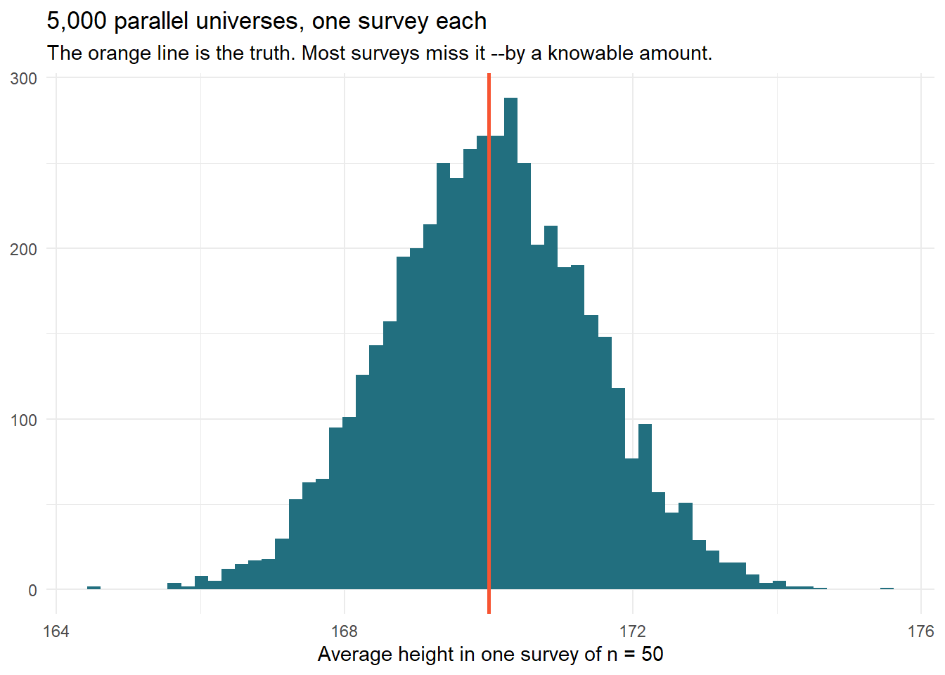
You’re off by almost a centimeter, and you did nothing wrong. That gap is not an error –it is sampling variation, and the only honest way to describe your estimate is to know how big that gap tends to be. So: run the survey 5,000 times.
Show the code
set.seed(42)surveys <-tibble(replicate =1:5000) |> dplyr::mutate(avg_height = purrr::map_dbl(replicate, \(i) mean(rnorm(50, 170, 10))) )surveys |>ggplot(aes(avg_height)) +geom_histogram(bins =60, fill ="#226F7F") +geom_vline(xintercept =170, color ="#F75431", linewidth =1) +labs(x ="Average height in one survey of n = 50",y =NULL,title ="5,000 parallel universes, one survey each",subtitle ="The orange line is the truth. Most surveys miss it --by a knowable amount." ) +theme_minimal()
1
map_dbl() runs the entire fake survey 5,000 times and keeps each mean –the sampling distribution of the estimate, conjured in one line.
This histogram is the single most important picture in statistics: the sampling distribution. Its spread –the standard error– is the answer to “how different could this have been?”. Everything in the next session (confidence intervals, p-values) is just a way of describing this histogram without having to draw it. But you can draw it, so you should, until reading it feels like reading a scatterplot.
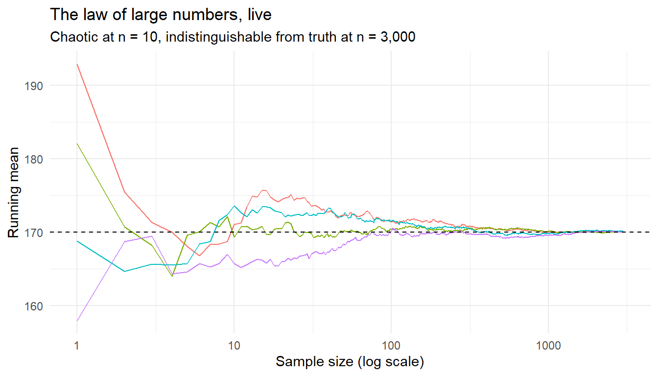
More data means your average converges to the truth. Don’t take my word –watch four random walks of the running mean:
Show the code
set.seed(7)lln <- purrr::map(1:4, \(walk) {tibble(walk =paste("Walk", walk),n =1:3000,running_mean =cumsum(rnorm(3000, 170, 10)) / (1:3000) ) }) |> purrr::list_rbind()lln |>ggplot(aes(n, running_mean, color = walk)) +geom_line(show.legend =FALSE) +geom_hline(yintercept =170, linetype ="dashed") +scale_x_log10() +labs(x ="Sample size (log scale)", y ="Running mean",title ="The law of large numbers, live",subtitle ="Chaotic at n = 10, indistinguishable from truth at n = 3,000" ) +theme_minimal()
1
The log scale is doing pedagogical work: it shows the violent early wandering and the calm convergence in one frame.
The catch people forget: the law says averages converge eventually. It says nothing about your n = 30 pilot study, where the running mean is still in its chaotic adolescence.
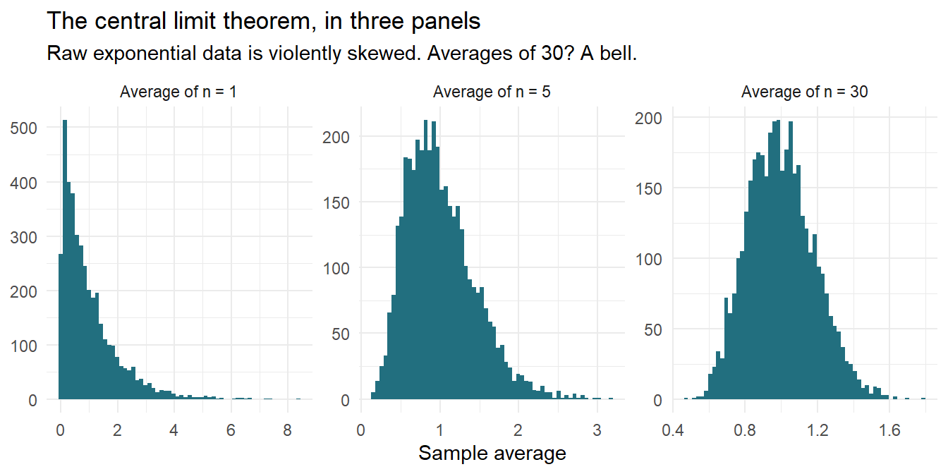
Central limit theorem: averages become bell-shaped
Stranger and more useful: sums and averages of almost anything become normally distributed, even when the underlying data is wildly non-normal. Take exponential data –incomes, waiting times, anything skewed:
Show the code
set.seed(99)clt <- tidyr::expand_grid(n =c(1, 5, 30), replicate =1:4000) |> dplyr::mutate(avg = purrr::map_dbl(n, \(k) mean(rexp(k, rate =1))))clt |>ggplot(aes(avg)) +geom_histogram(bins =60, fill ="#226F7F") +facet_wrap(~n, scales ="free",labeller =labeller(n = \(k) paste0("Average of n = ", k))) +labs(x ="Sample average", y =NULL,title ="The central limit theorem, in three panels",subtitle ="Raw exponential data is violently skewed. Averages of 30? A bell." ) +theme_minimal()
1
At n = 1 you see the raw distribution (skewed). At n = 5, still lopsided. At n = 30, the famous bell –grown out of data that looks nothing like one.
This is why the normal distribution is everywhere: not because nature loves bells, but because we love averages, and averaging manufactures bells out of almost anything1.
PART IV: Why single numbers lie
The habit this session installs: never report a number you wouldn’t show the distribution of. A mean without its spread is a coin with one face. Three self-defense rules:
Plot the raw data before summarising it –session 2 of the workshop gave you every tool; distributions with the same mean can tell opposite stories.
Ask “compared to what?” Every “sales rose 4%” hides a sampling distribution –is 4% a signal, or is it inside the range that pure noise produces? (Next session answers this precisely.)
Simulate the boring explanation first. Before celebrating a pattern, write ten lines of R in which nothing is going on and see how often the pattern shows up anyway. You will be humbled more often than you expect.
TipExercises 🏋️
Change the survey simulation to n = 5,000 per survey. How much narrower is the sampling distribution? Check the \(\sqrt{n}\) rule: 100× the sample should give 10× the precision.
Replace rexp() in the CLT simulation with rbinom(k, 1, 0.02) –a rare event, like a 2% conversion rate. How large must n be before the bell appears? (This is why A/B tests on rare outcomes need huge samples.)
The birthday problem: simulate rooms of 23 people (sample(1:365, 23, replace = TRUE)) and estimate the probability at least two share a birthday (any(duplicated(...))). Before running: write down your guess.
Simulate rule 3 in action: generate two completely independent variables of n = 20 with rnorm(), compute their correlation, repeat 1,000 times. How often does pure noise produce |correlation| > 0.3?
Key takeaways
Every computed number is one draw from a distribution of numbers you could have computed instead.
Simulation answers “how different could this have been?” without needing a theorem.
The law of large numbers and the central limit theorem are demonstrable, not just provable.
Before trusting a pattern, simulate the boring world where nothing is going on and see how often it appears anyway.
“Almost” is load-bearing. Distributions with extreme tails –wealth, city sizes, pandemic outbreaks– break the CLT’s assumptions, and averages of them stay treacherous at any n. When your data spans orders of magnitude, plot it on a log scale before trusting any average.↩︎
Citation
BibTeX citation:
@online{amaya2026,
  author = {Amaya, Nelson},
  title = {Embrace the Noise 🎲},
  date = {2026-07-01},
  url = {https://r4dev.netlify.app/sessions_thinking/01-uncertainty/01-uncertainty},
  langid = {en}
}